Overview:
Casio, a global electronics company specializing in watchmaking to provide durable, affordable, and timeless pieces, is currently branded more for a Gen-X audience. The objective of this project was to create a new visual identity system that will connect with a younger adult audience that seeks functional fashion.

Ideation:
I took inspiration from vintage editorial magazines to fuse the elegant chic feel while making the products the focal point. The campaign concept is explored through the arrangements of the bottles interacting with the glass to convey the playful tone of the brand.
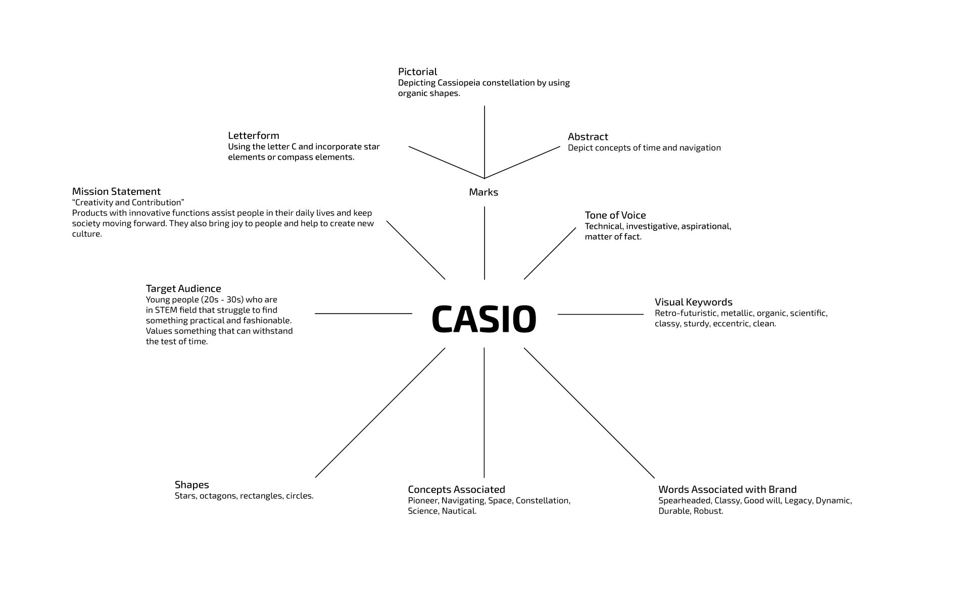
Casio identity mind map.

Casio logo concept sketches.

Casio refined concept one.

Casio refined concept two.

Casio refined concept three.
Design:
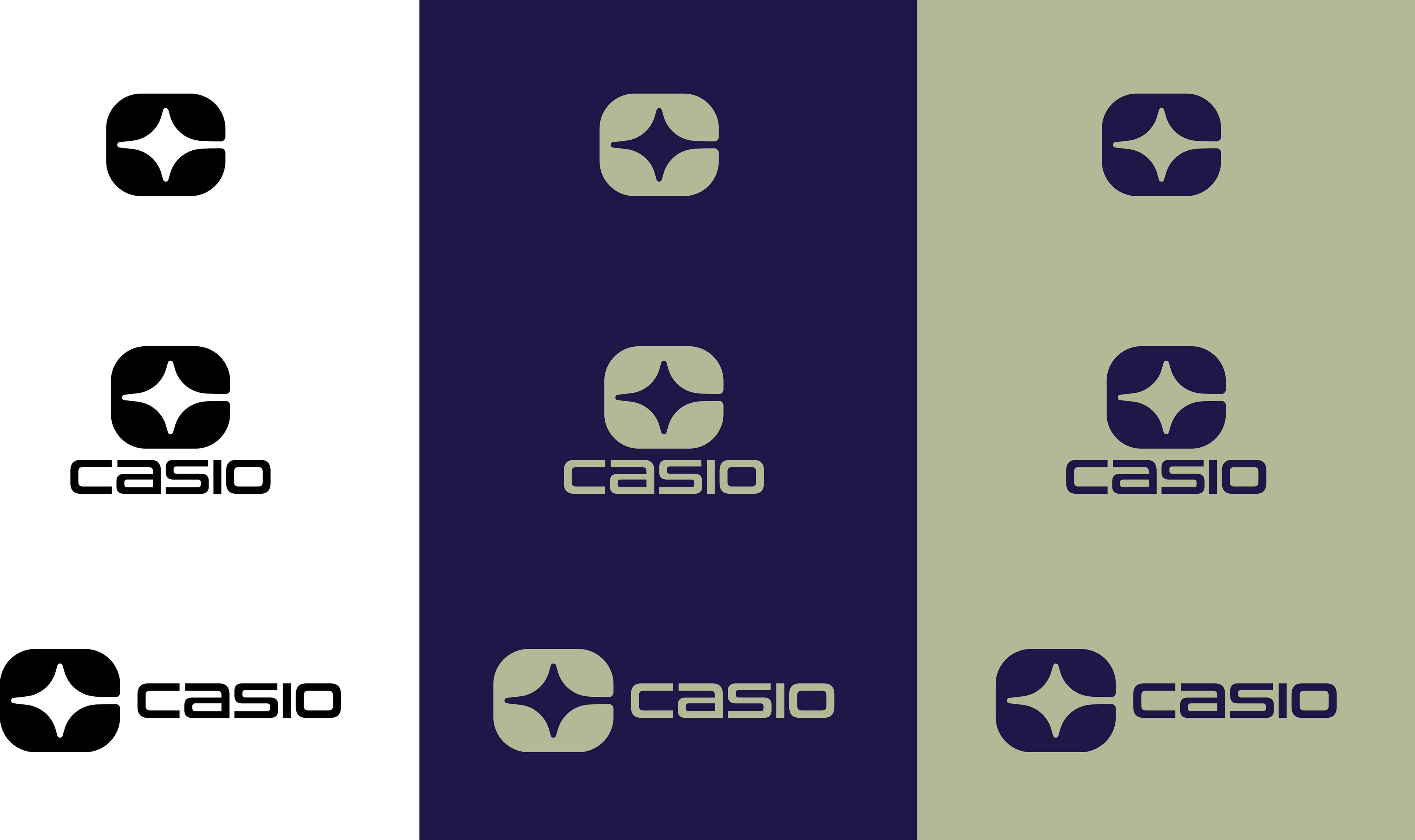
I ended up choosing one of the earlier sketches that I made due to its ties with the stars and how they were used as a navigational system, which seems fitting to the brand’s core values. The wordmark feels softer, which lends to the sleek feel that the rebrand is trying to achieve. The final brand system featured futuristic typefaces, while the color palette is an ode to their retro style products and digital watch faces.
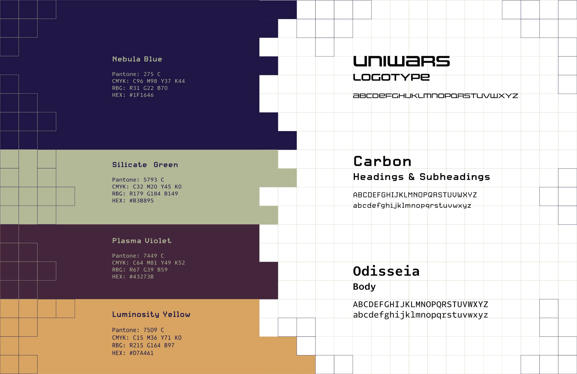
Casio color palette and type system.
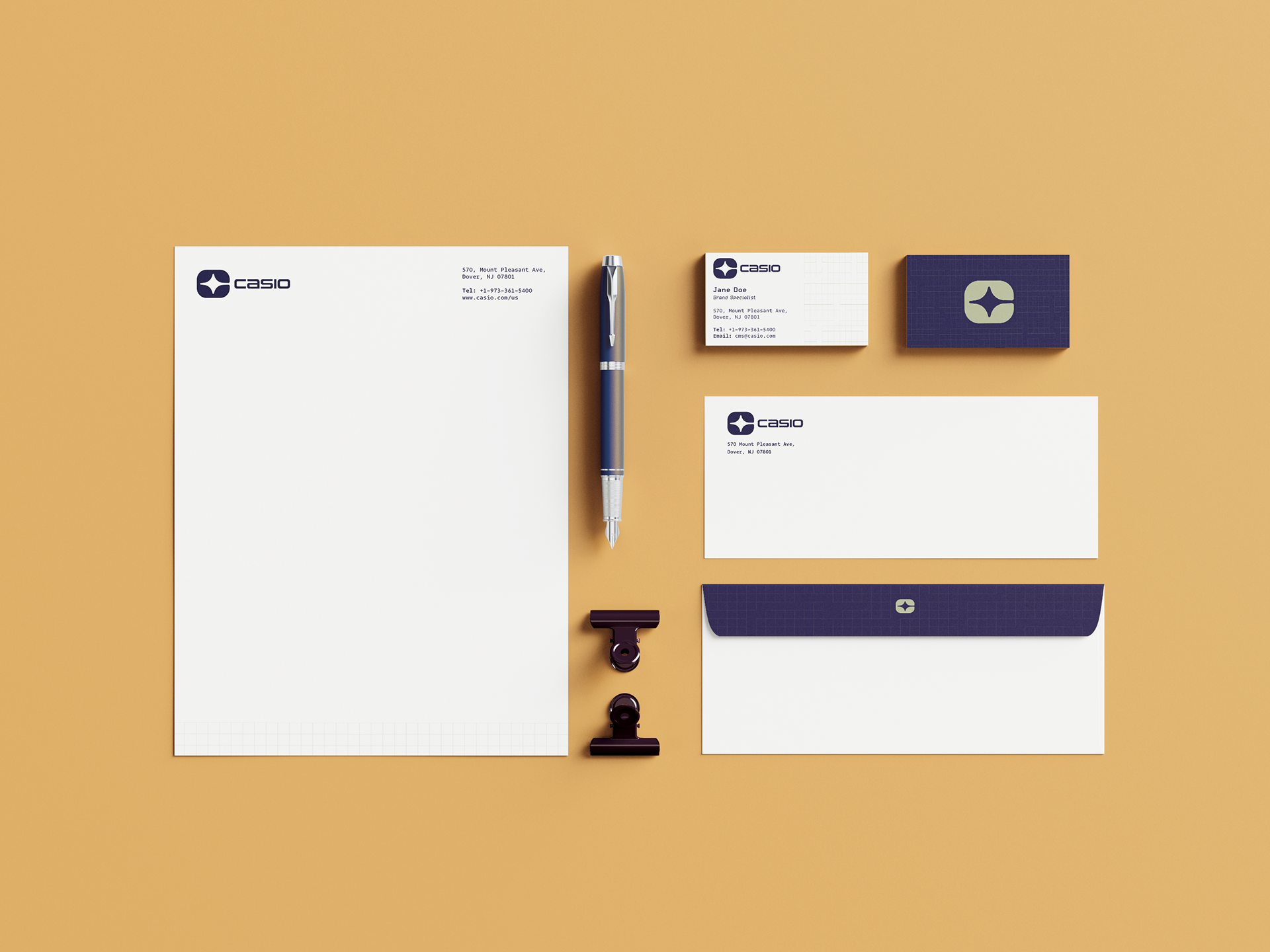
Implementation:
The applications feature lifestyle images with sample watch products with the new logo. A stationery set and watch box is also included to show how the design system is implemented.
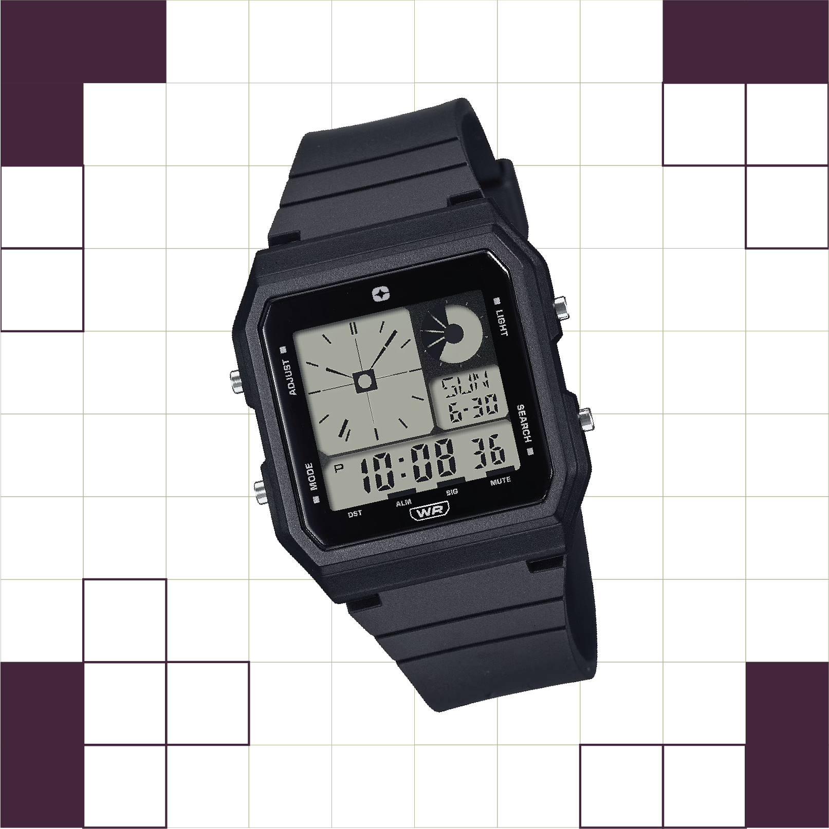
Watch mockup #1.
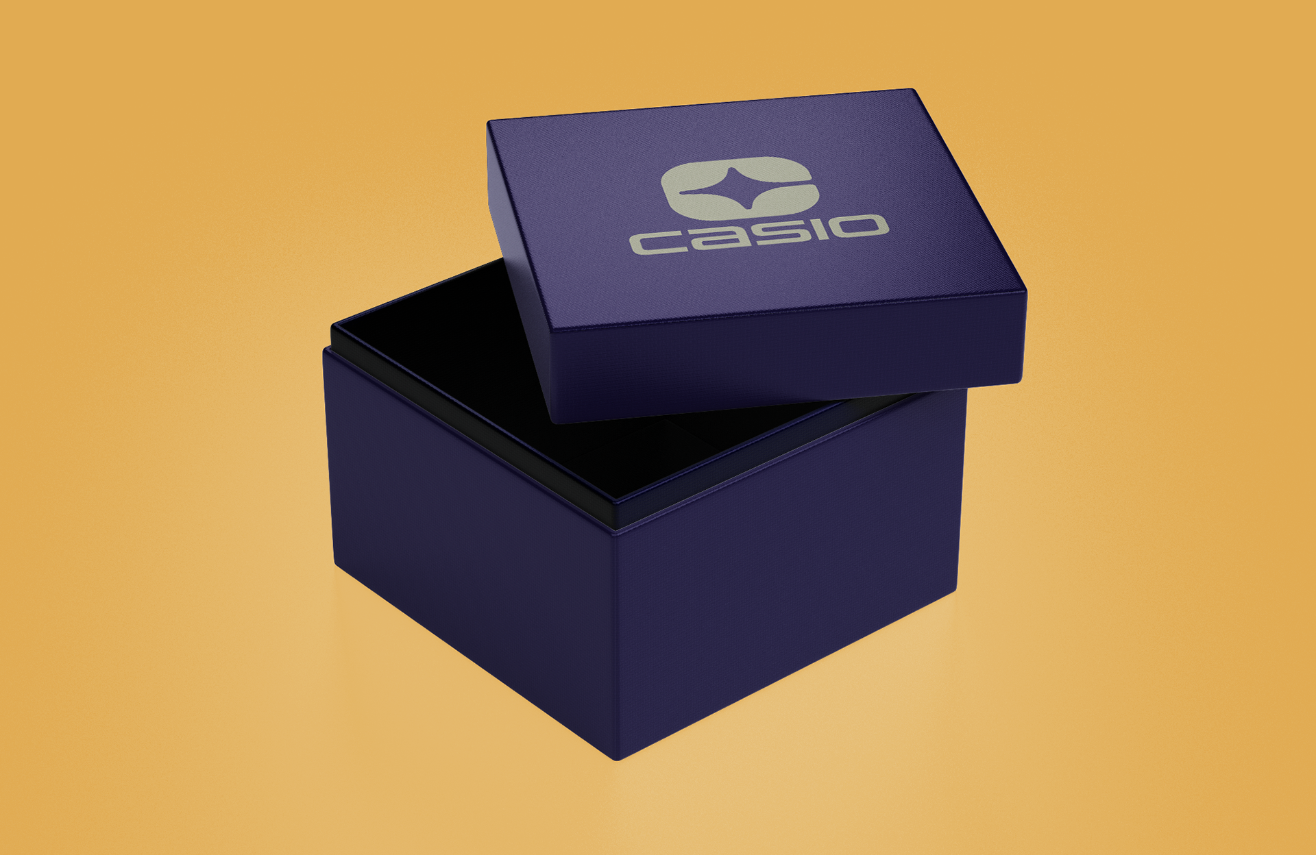
Casio watch box mockup.
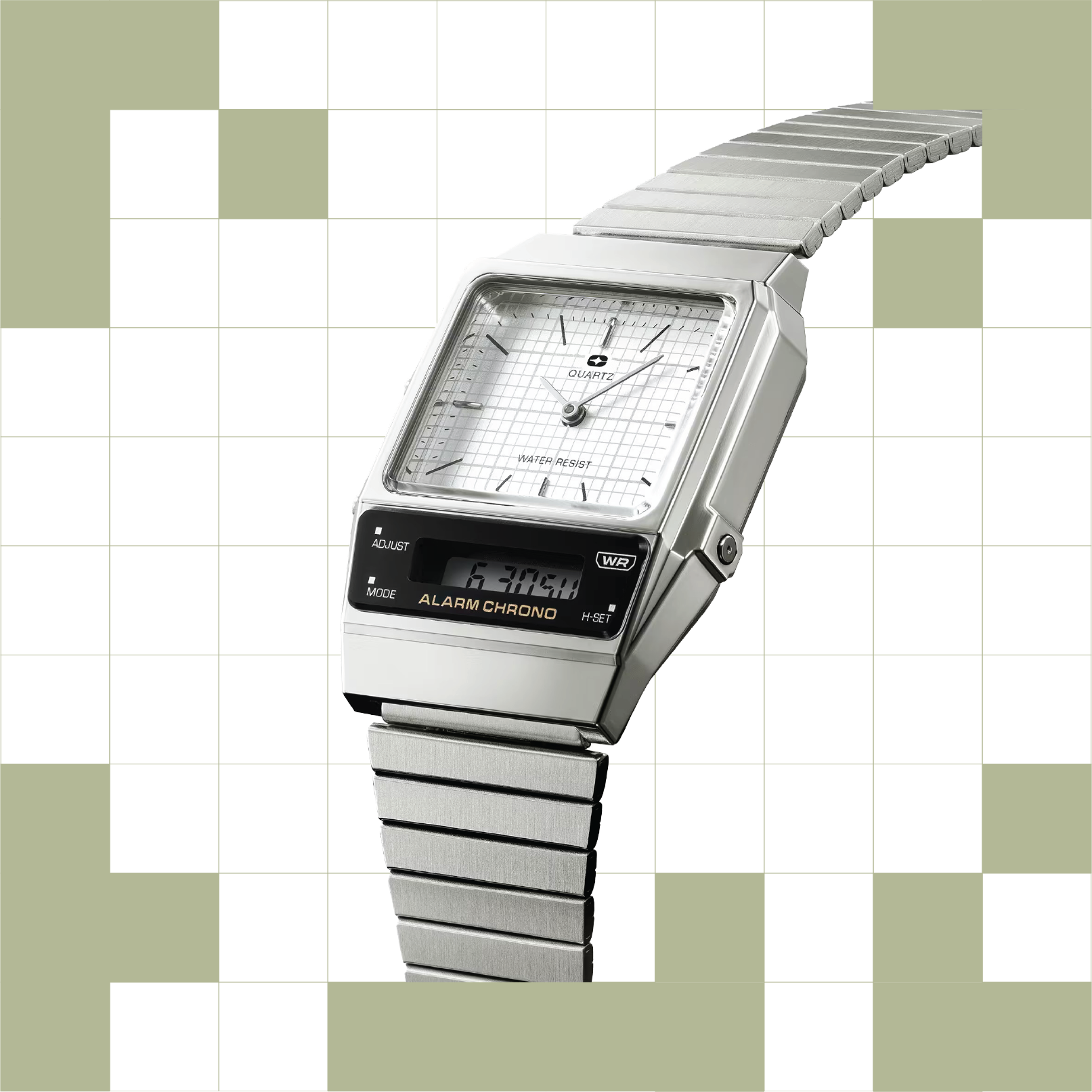
Watch mockup #2.
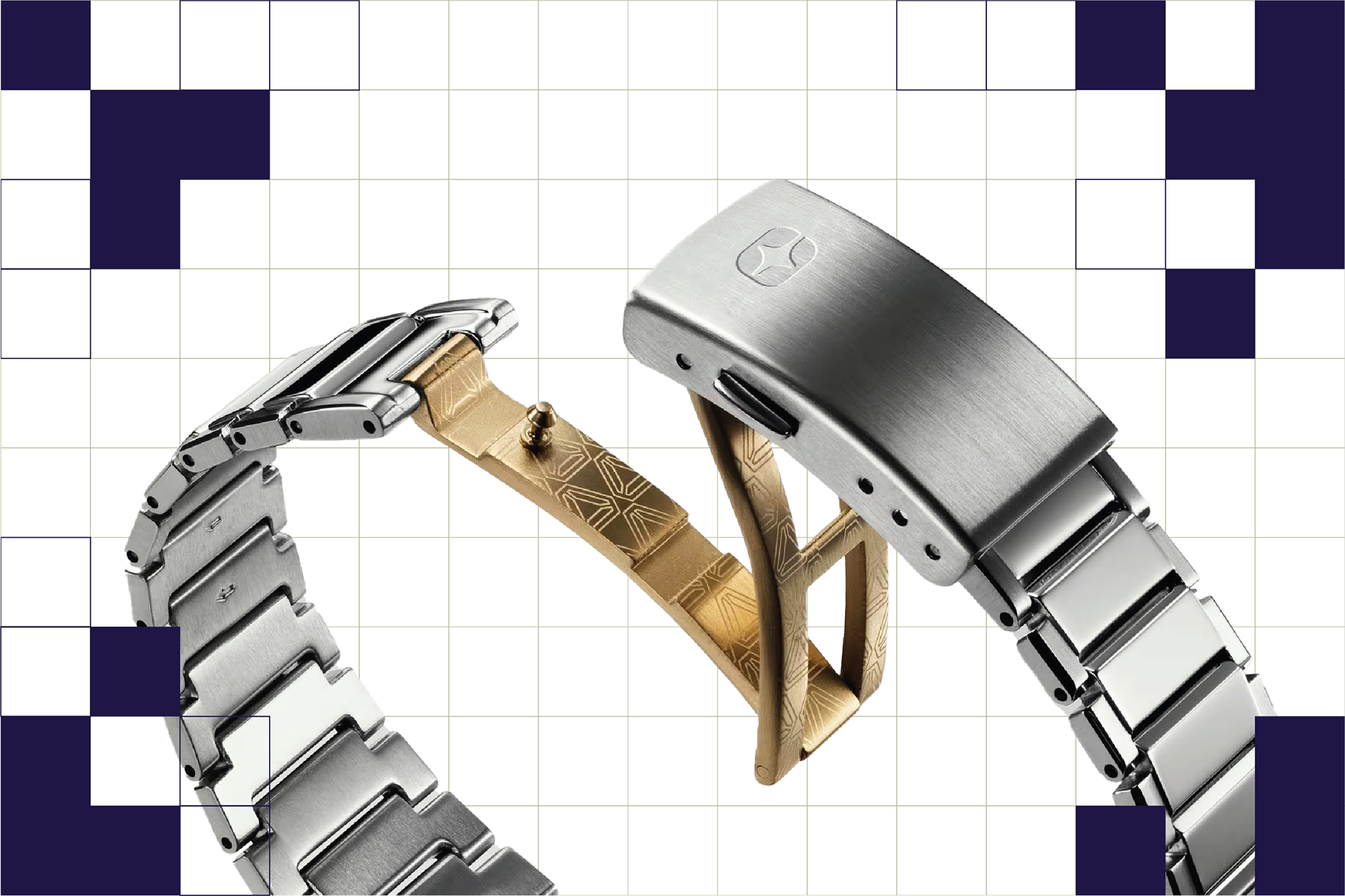
Watch mockup #3.