
Overview:
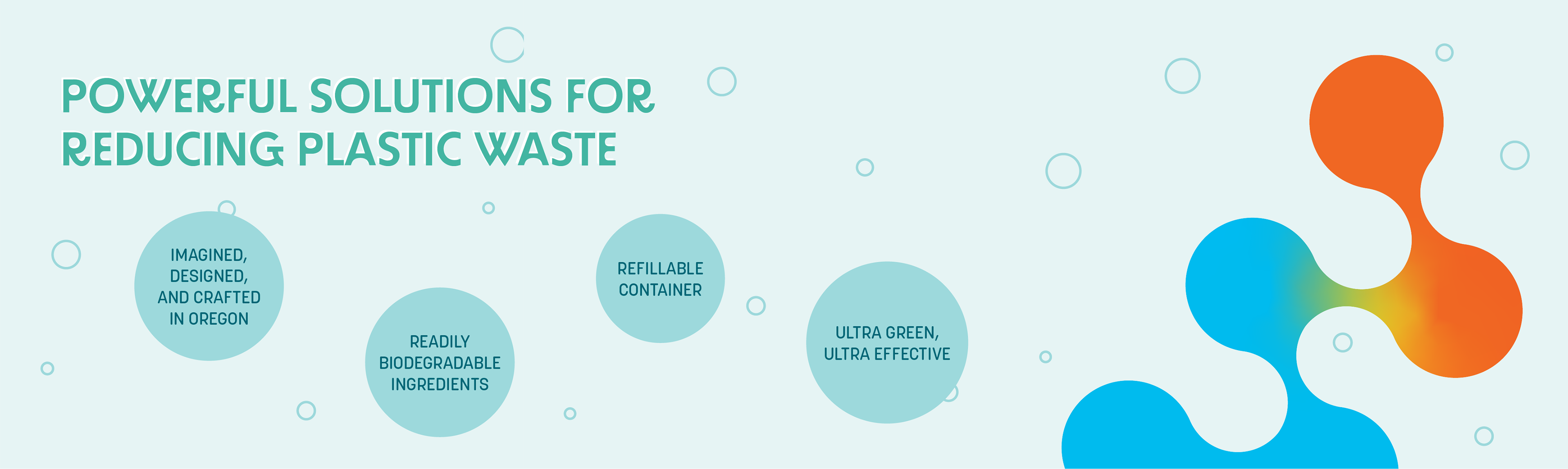
Wallowa Valley Cleaning Products, an Oregon-based cleaning company sought out to create one of the best cleaning products and set themselves with a whole new level of excellence. Finding the right balance between heart and science, this rebrand concept mentored under Murmur Creative seeks to capture the products' effectiveness while emphasizing the environmentally safe ingredients.
Collaborators:
Mina Ho, Tabitha Baber, Ellie Counts.
Ideation:
The intention was to create a brand-new visual identity system for WVCP as they want a visual that subtly suggest their sustainable mission and stand out from traditional "greenwashing" designs. The concept leans heavily into the scientific tone to translate the founders' goals while combining natural elements to highlight the Wallowa valley.
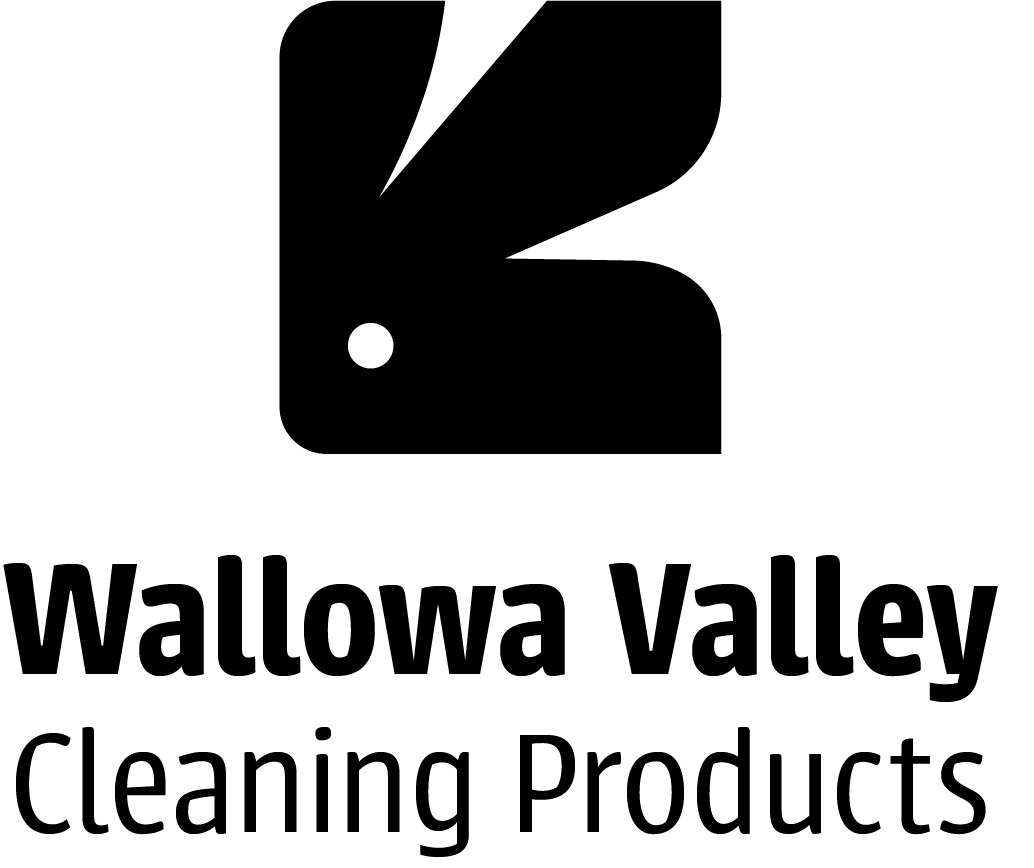
Logo concept 1
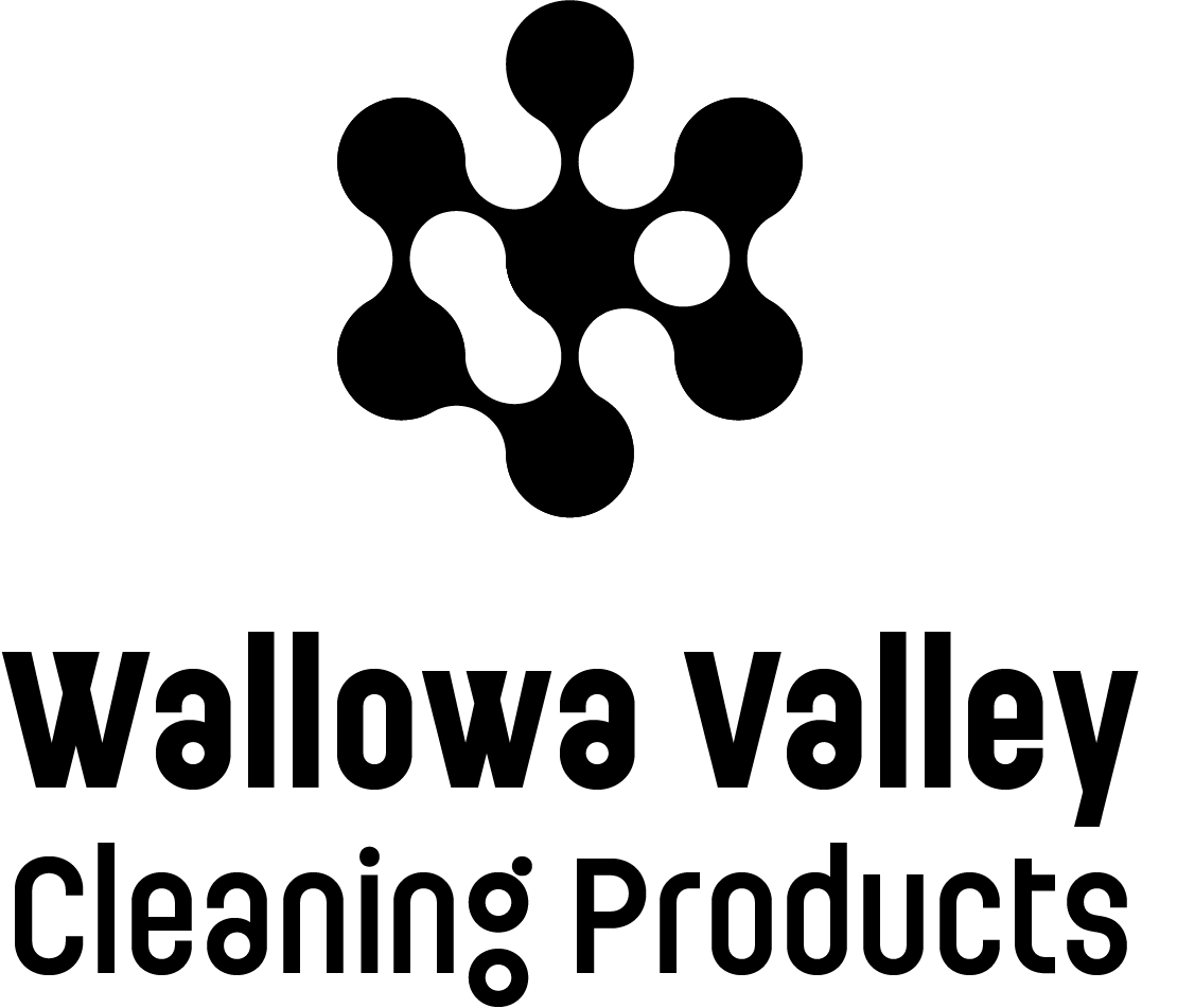
Logo concept 2
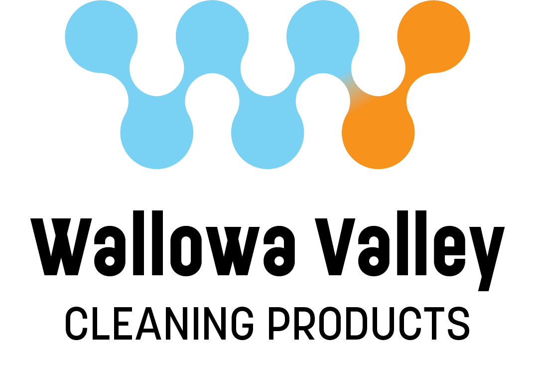
Logo concept 3
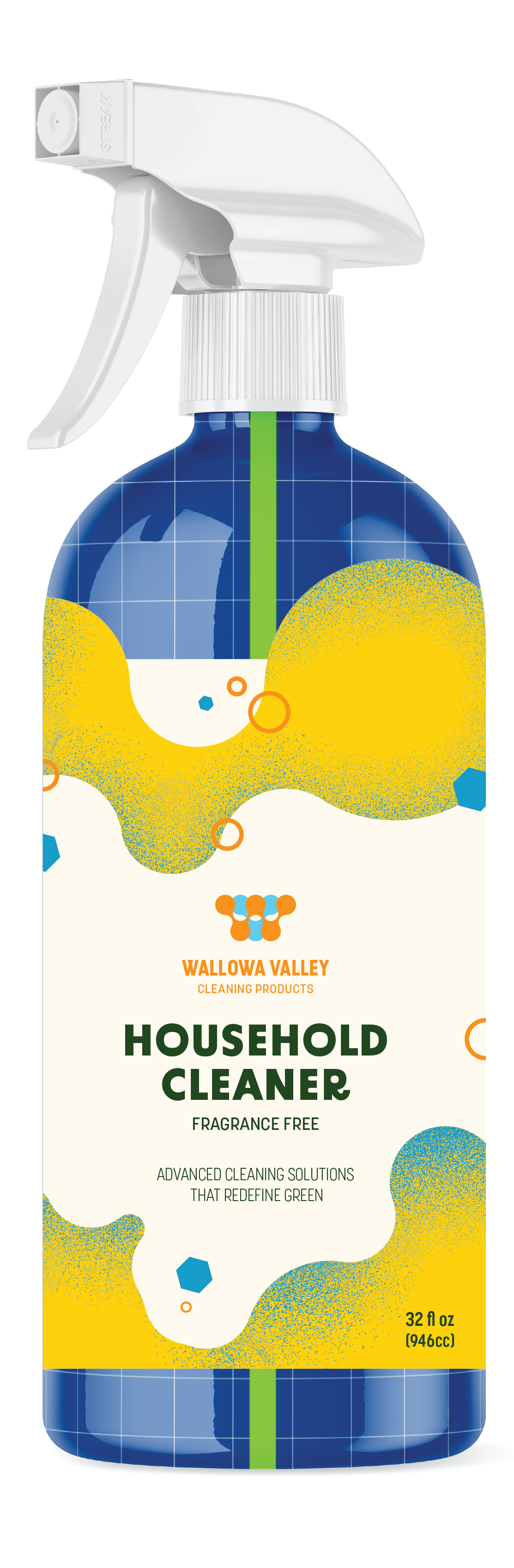
Bottle concept 1
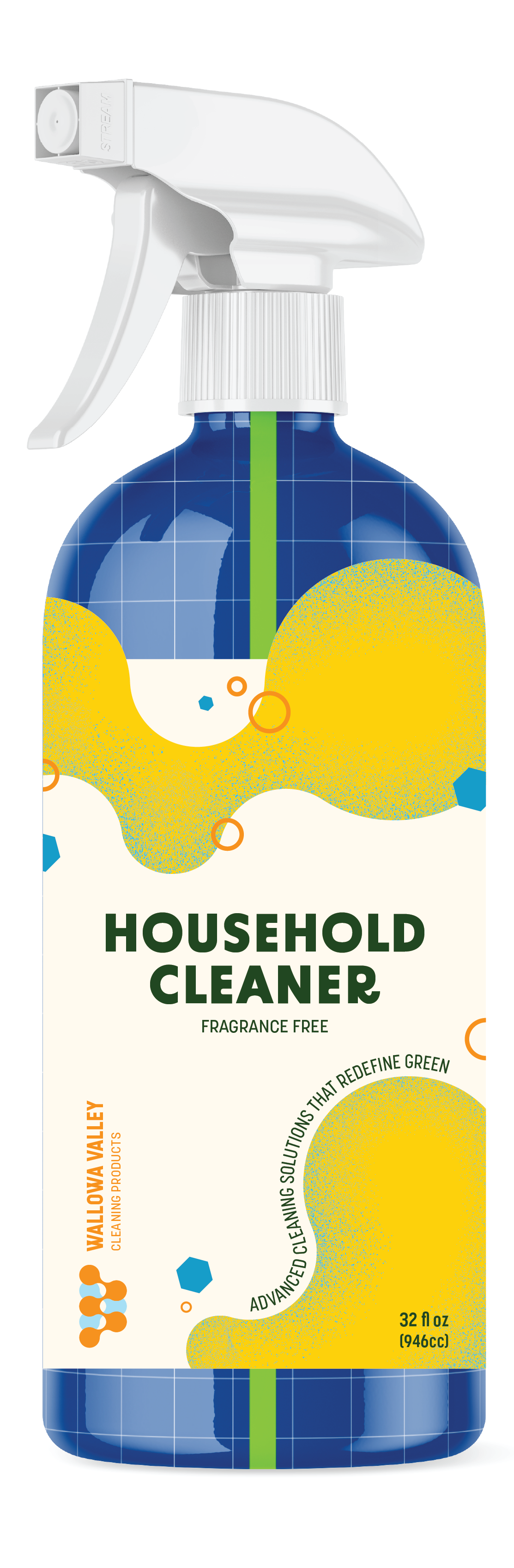
Bottle concept 2
Bottle concept 3
Design:
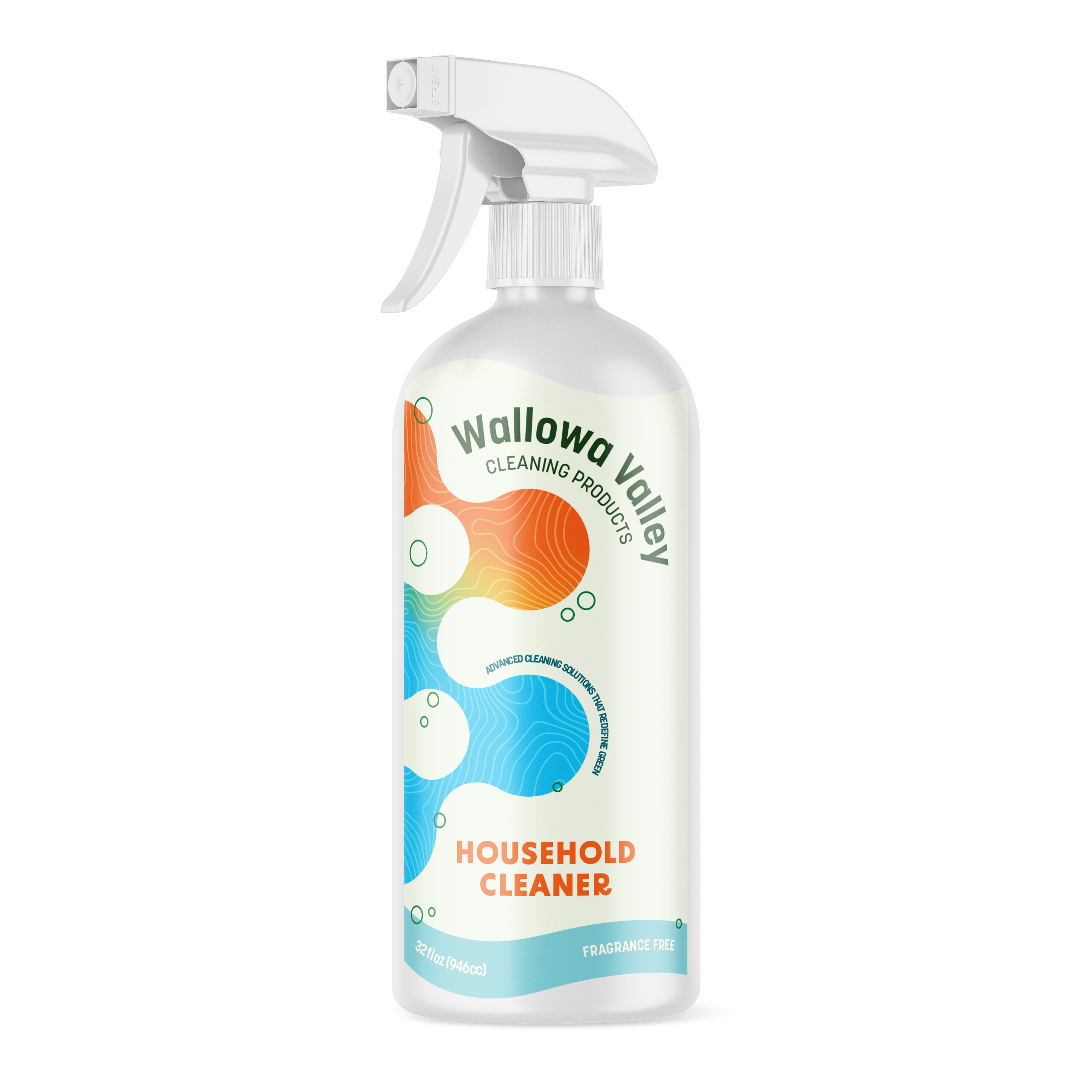
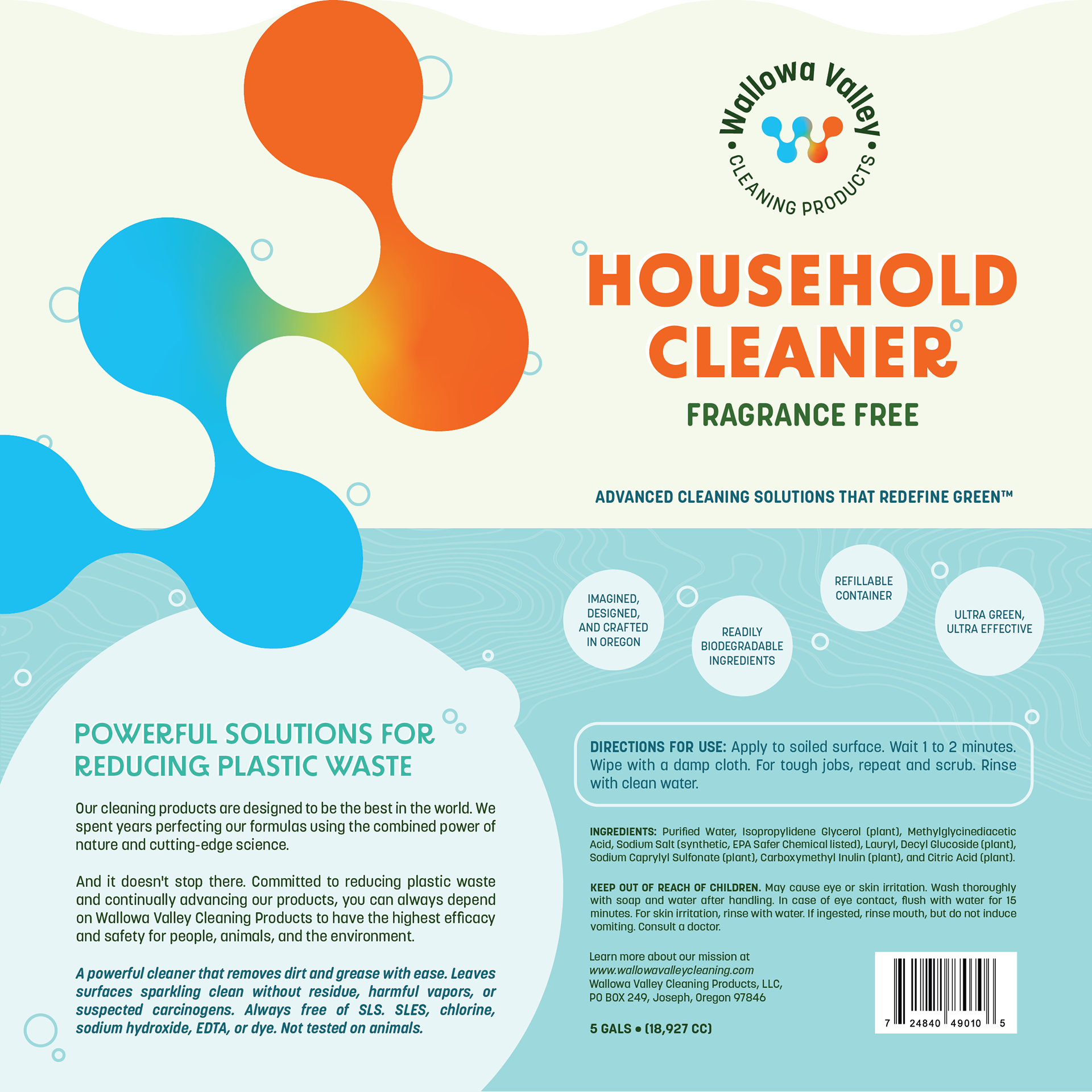
The final design is rounded and circular to convey the sudsy feel of the cleaning products. The large "W" mark is a combination mark taken from the initials of "Wallowa Valley" and the gradient suggests a beautiful harmony of the lake and flora. A topographical element within the darker parts of the design can also develop a tie to the region. The final packaging labels carry a wavy die-cut to create a subtle sense of playfulness that will stand out from the shelves.
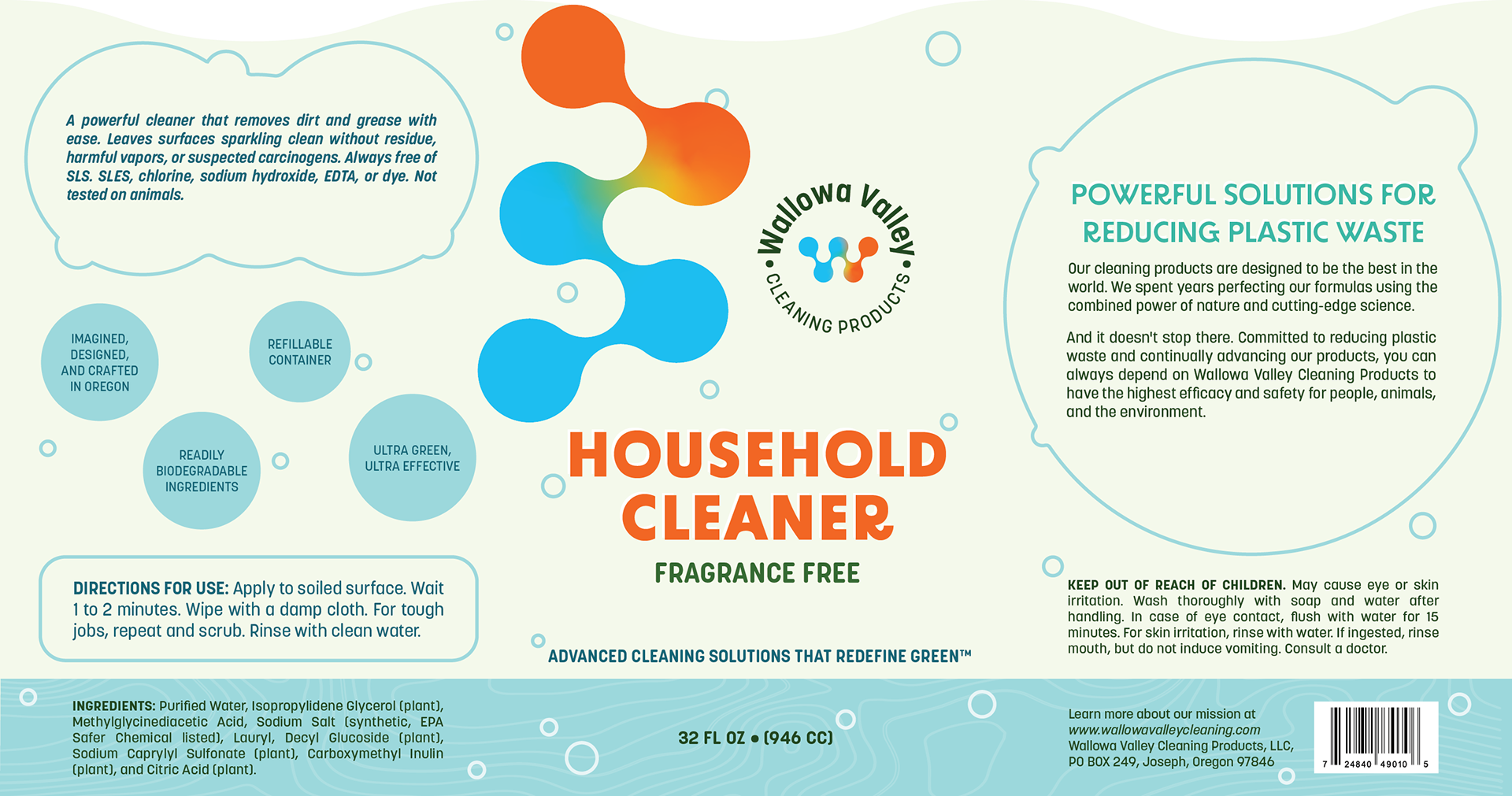
32 oz Bottle Packaging Label
5 Gal Dispenser Box Label
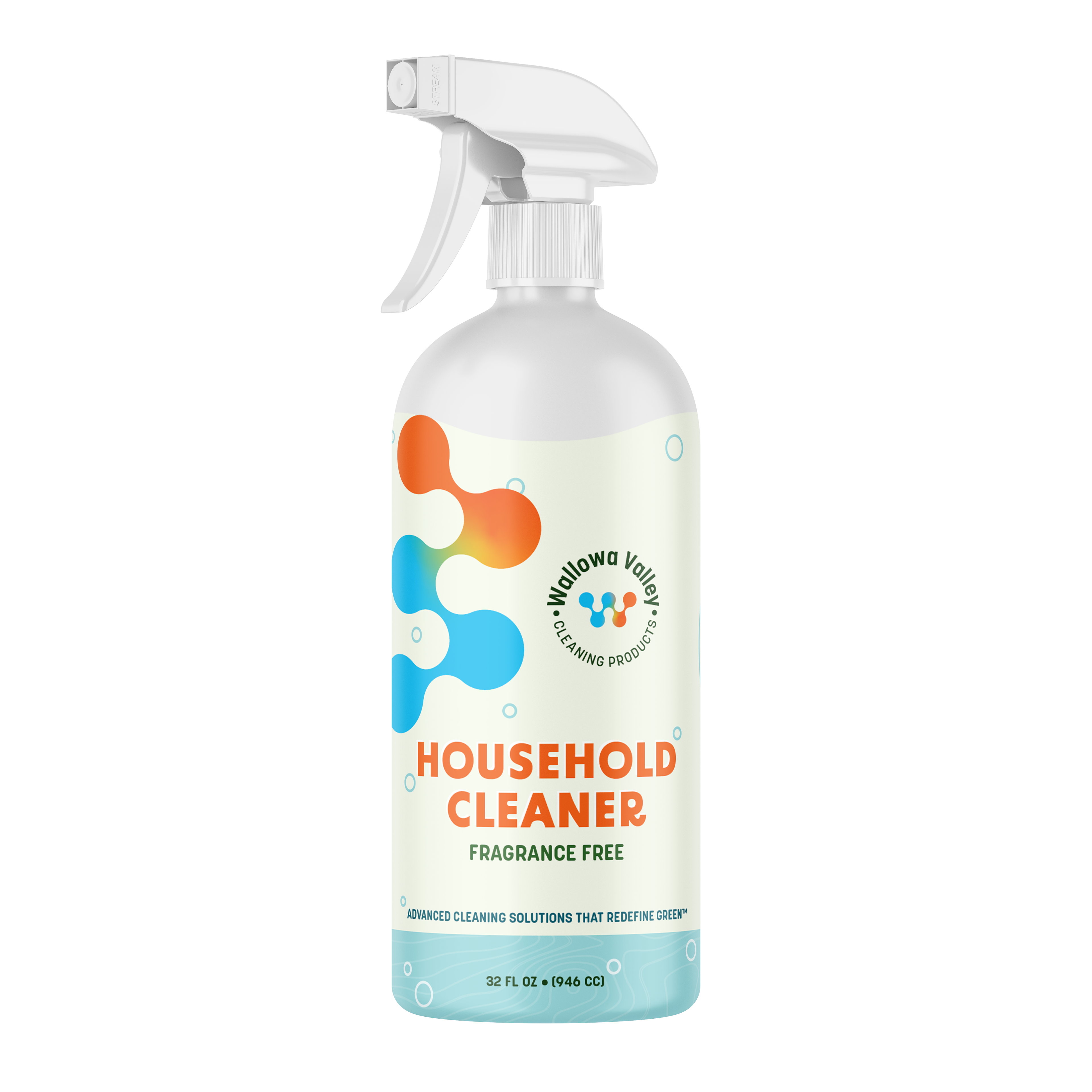
32 oz Bottle Packaging Mockup
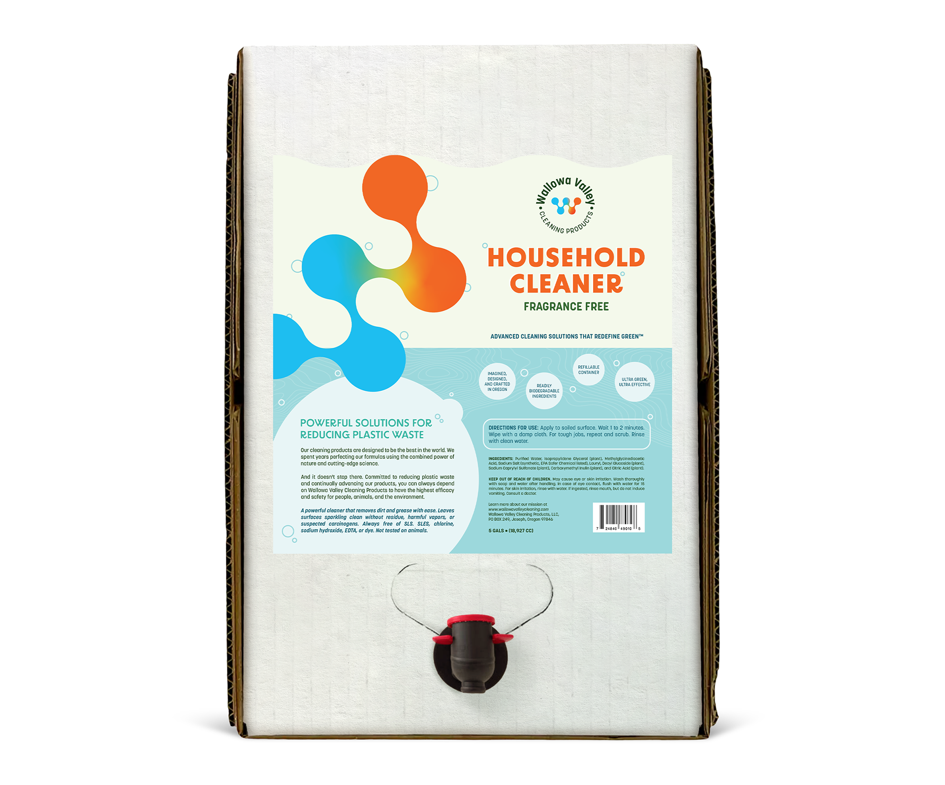
5 Gal Dispenser Box Mockup
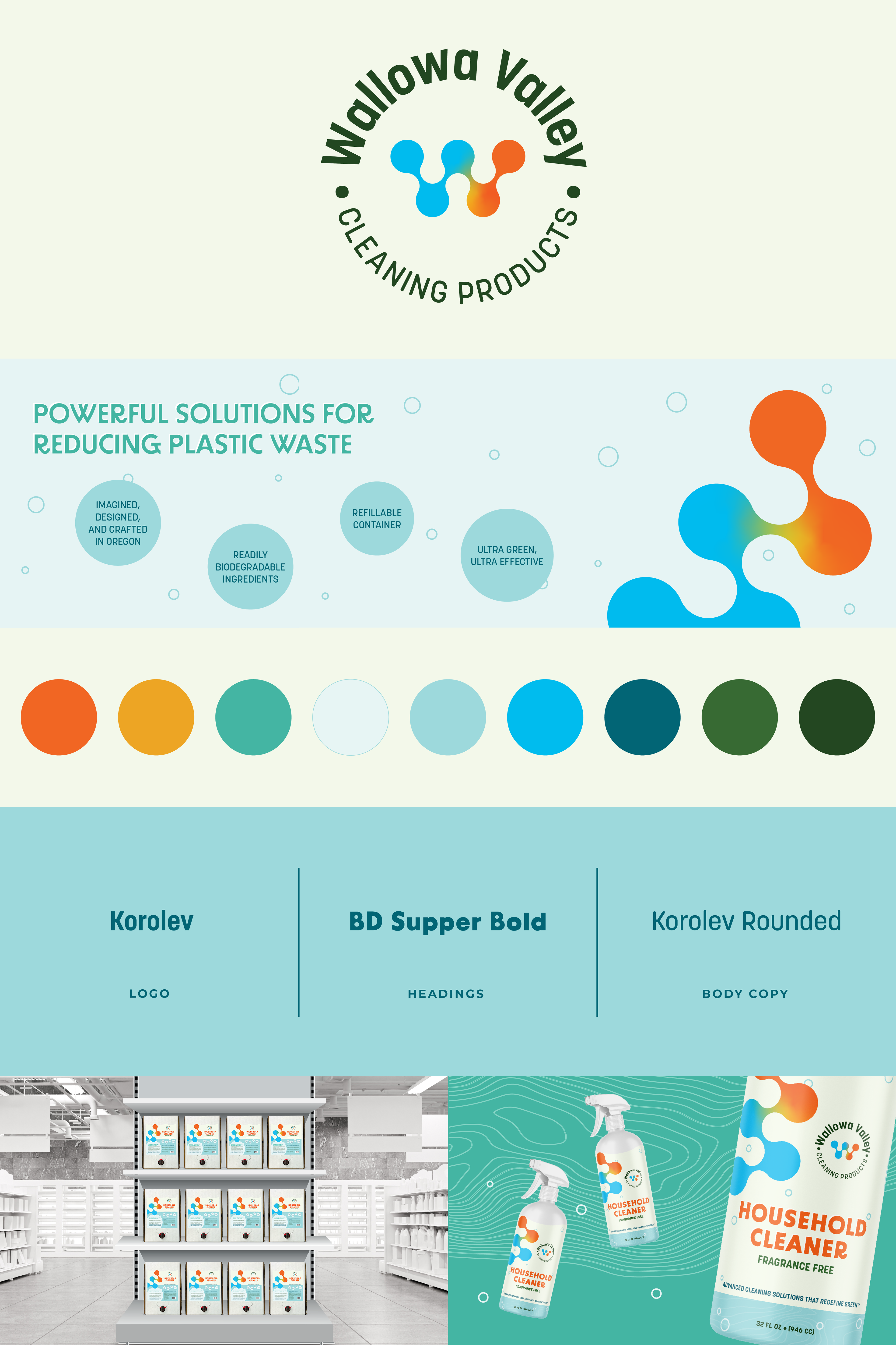
Wallowa Valley Cleaning Products Brandboard.